


 I see a lot of business cards. Some are good. Some are, well, not so good. I’m not a graphic designer, so I can’t advise you on colors, specific layout or the best font families for your brand, but I can give you some suggestions, based on usability, for effective business card design when creating or redesigning yours.
Accept that the majority of people receiving your business card are going to scan it. This means you need to lay it out in a way which will be readable by a card scanner. No upside down text because it looks cool. No, having your text scroll around the edge of the card isn’t a good idea. Do go for good contrast between the background and the text. A client recently sent me a proof of a new card. It was attractive, but there was a huge image covering about half the card which was only a few shades lighter than the text. My eyes had a difficult time with the contrast. A scanner would have fits.
So what if you are a creative type and want your card to reflect that? You can create a scannable card which gets across your business personality. Here was one I liked. Simple but makes the point, and a computer will be able to read most of it.
There’s a difference between scannable and readable. As I wrote this post, I went through a box of business cards on my desk, and one made me stop and stare, not in a good way. There was text in gold type which couldn’t have been more than 4 point (tiny!). The text wasn’t something that needed to be scanned, so a computer wouldn’t care. But as a person, I strained to read it to try to determine if it was important. Not a good idea.
As I thumbed through the box of cards, I found one I wanted to like. It was a bi-fold card. There was lots of good information on the card, and she used the expanded real estate well. However, it would be difficult to scan, and it’s too thick to fit well in a card holder. It doesn’t sit well in a pile because it opens up along the fold. Is it a business card disaster? Certainly not, but consider carefully before creating such a card. It was probably also relatively expensive.
What about alternate materials? I’ve seen some interesting wooden cards, and I kept a metal card in my car for years because it was too cool. One of my contacts has her business cards as magnets. She’s in the home improvement industry, and she wants her information easily accessible. It works. I have just a few items on my fridge door, and it’s one of them.
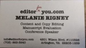
People like to write notes on cards. If you don’t leave them any space to do so, they might be less likely to keep the card or remember anything about you. No, I’m not saying leave the entire back blank. My card uses both sides, but I left enough white space to make a short note.
All cards need to have the basics, name, email address and website at the minimum. Social media handles or sites are fine, assuming you use them regularly. QR codes can be good, but be strategic. Next week I’m doing an entire post on QR codes.
What about a physical address? If your business is brick and mortar, you definitely need it. How about a tiny Google map location on the back of the card? If you work out of your home, maybe. I do have my home office address on my card, and it’s never caused me problems, other than a bit of extra junk mail. I’ve never felt that the address made me less safe, and it does lead to a few more holiday cards.
No need to double-up on elements, though. One card I looked at recently had the business website on the front and back. There was no need for that. A QR code should not link to your website home page. It’s redundant.
There’s my thoughts. Any particularly good or bad business card designs you’d like to share?